Energy Mix in the EU
The motivation for this post was to create some minimalist visualisations that tell a bit of a story. I thought energy supplies in the EU would be an interesting topic as I wanted to do something somewhat geographical and topical.
A Quite Long Note on Data and Definitions
The majority of the data used here is from the EU’s energy balances on Eurostat. While Eurostat’s energy data has good coverage, it isn’t initially intuitive to understand. Eurostat provide a number of measures of energy supply and consumption at different stages of the energy transformation and consumption process. There are a variety of measures of production and primary energy consumption, notably, Total Energy Supply (TES), which measures the total amount of energy needed to satisfy all domestic energy needs for a country, including losses and consumption from energy transformation, distribution and transmission. (energy from primary production + imports - exports + recovered/recycled products + stock changes - international maritime bunkers & aviation). There are also a couple of other definition of primary energy consumption e.g. Gross Available Energy (GAE) & Gross Inland Energy Consumption (GIC). The differences from TES are that GAE includes both international maritime bunkers and aviation and GIC included international aviation, and thus both include some energy not technically used for each country’s domestic energy needs - therefore I felt TES was a better measure to use to show each country’s energy usage. See here for extra information on Eurostat’s energy balance methodology.
Ideally though I would want to use statistics of final energy consumption (i.e. energy balances after losses from transformation, distribution and transmission). However, the final energy consumption stats supplied by Eurostat don’t specify the original source (e.g. nuclear, renewables) - as they break down energy by it’s final form (e.g. electricity, gas etc…), so for example, you cannot then say what % of energy comes from nuclear sources and the % of energy from renewables ends up being vastly underestimated as a lot of this is counted as electricity or heat. Therefore, I used Total Energy Supply here, as it captures energy supply by it’s original source.
Additionally, secondary energy products (e.g. electricity and heat), can sometimes have negative Total Energy Supplies for countries. This is because only trade + stock changes are recorded for secondary products as they are produced from primary energy sources (e.g. coal, renewables) during the energy transformation process. This is problematic as 1) the negative values generally indicate a net export of a secondary product and 2) it ruins the visualisations. In an ideal world we could account for these negative values in terms of the primary energy products that are used in producing the secondary products, but it doesn’t seem possible to do that with the available data. That leaves us with two approaches to dealing with this: to either exclude secondary products entirely or to just exclude them when they are negative. I decided to go with the second approach as otherwise a sizeable chunk of the energy supply of some nations would be missing. The downside to doing this though is that for nations with negative values there is now technically a small discrepancy as there is energy being produced but not accounted for - however this has only a minimal impact on the actual visualisations here (where there are negative values they are generally below 1% of the Total Energy Supply). This appears to be a similar approach to figure 6 here.
Also note that the figures for renewables here use a slightly different definition than the figures that the EU base their renewable energy targets on. For their targets they look at “Gross Final Consumption of Energy” - which is final energy consumption (energy used in industry, transport, households… ) including electricity and heat losses from distribution and transmission, but excluding energy consumption and losses from transformation. It is also a definition that doesn’t appear in the EU’s energy balance data, which is a bit annoying. Additionally, some biofuels are not included if they don’t meet certain sustainability criteria, wind and hydro power have to apparently be normalised and there are some other technical differences from other metrics. The exact differences of these details are not particularly clear e.g. it’s not very clear what biofuels are included and how wind and hydro are normalised. Finally, the figures given for this metric are only the % share of renewables in the energy mix and don’t break this down by the type of renewable energy (e.g. wind, solar). So because of this and to keep the analysis consistent with the rests of the data presented here, I have opted to look at renewables in the Total Energy Supply. See this page for more details on the differences between renewable energy definitions.
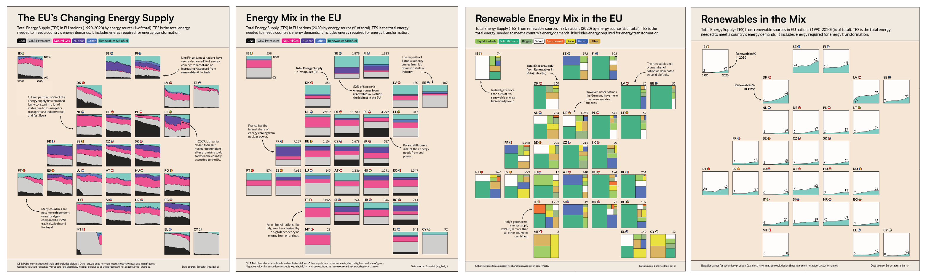
Energy Mix
The first thing to look at is the energy mix of each nation (i.e. the energy supply broken down by energy source). The chart below shows the supply by each source as a percentage of the total energy supply for EU nations in 2020 (For a definition of the total energy supply see the note on methodology and definitions above).
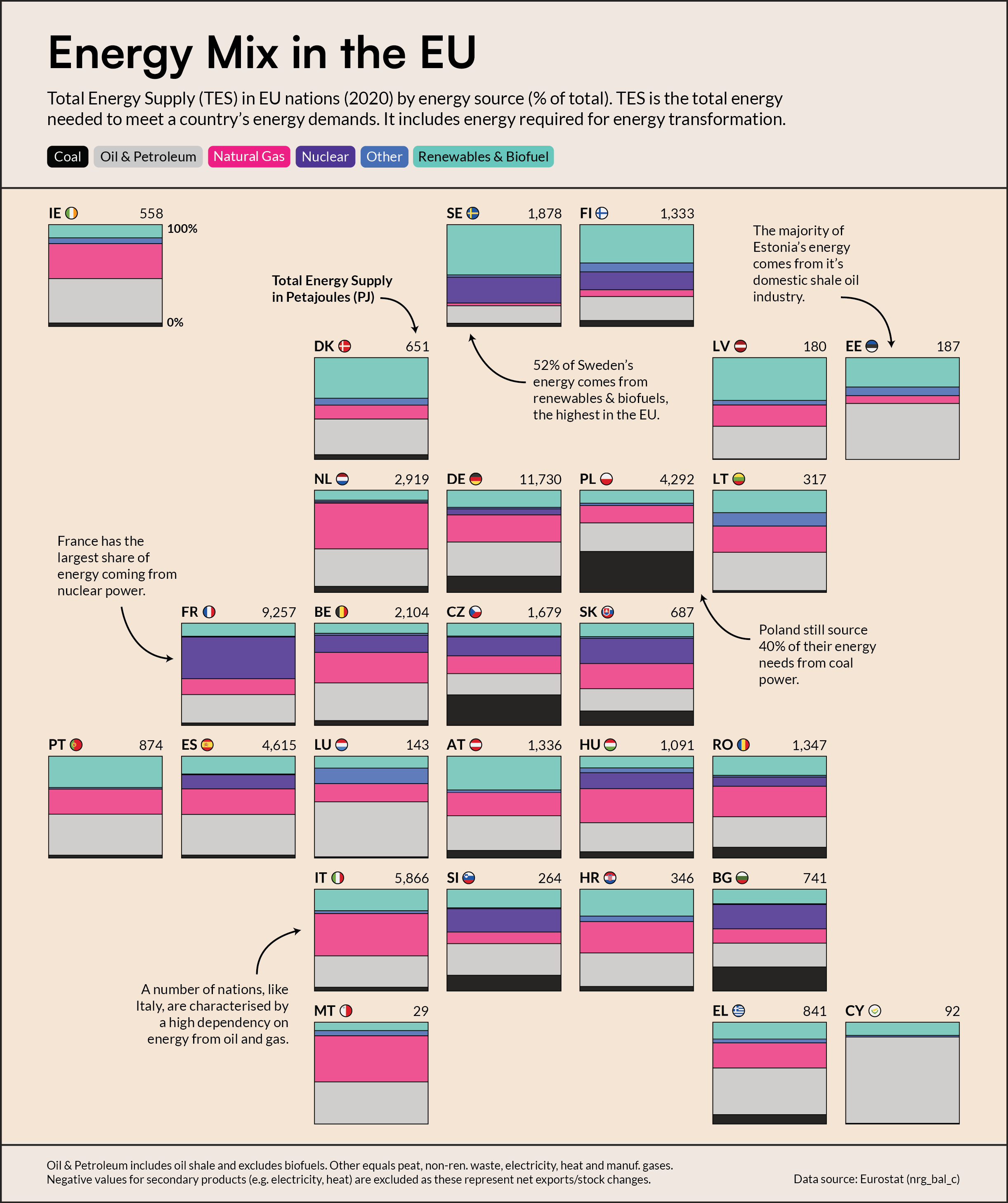 Figure 1: Energy Mix in the EU
For most EU countries, the majority of their energy supply comes from fossil fuels, but there is still quite a wide variation in energy mixes across the EU. For example, a number of nations are still relatively reliant on coal power (Poland, Bulgaria, Czechia, Germany). Others have over 50% of their energy supply originating from Oil & Petroleum (Estonia, Cyprus, Luxembourg). In the case of Estonia this is due to their domestic shale mining operations. Contrastingly, there are nations that source a large amount of energy from renewables (Sweden, Finland, Latvia). You can also see other nations with a lot of nuclear in their energy mixes (France, Bulgaria, Slovenia, Slovakia).
It’s also possible to see how each country’s energy mix have changed over time, between 1990 and 2000 - see Figure 2 below.
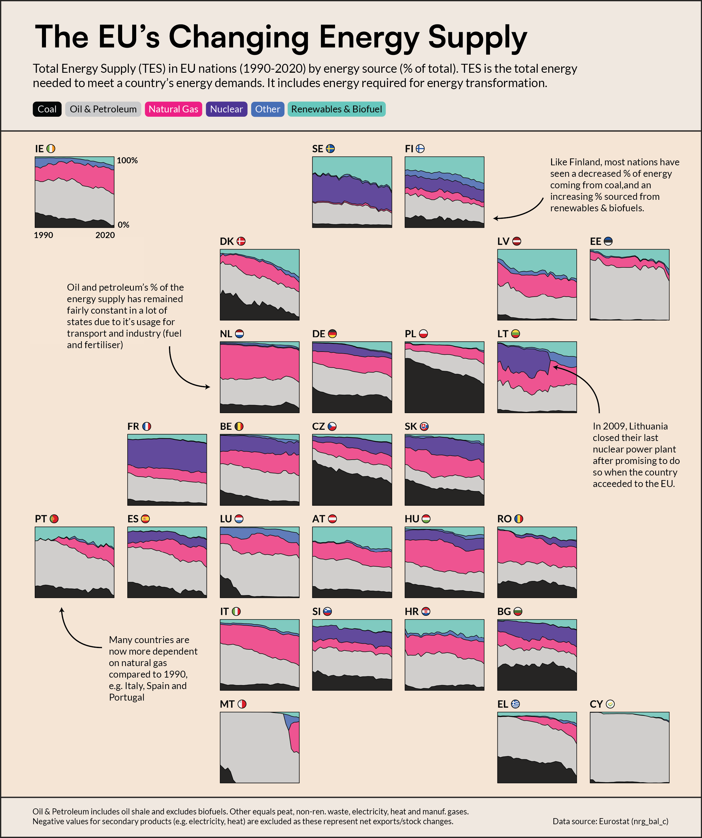 Figure 2: The EU’s Changing Energy Supply
Unsurprisingly, in basically every nation there has been a the decline of fossil fuels as renewable adoption has increased. This is particularly the case with coal, which is being broadly phased out across the bloc. There has however been an increase in energy derived from natural gas in quite a few states (e.g. Spain, Germany, Ireland, Belgium) - partly to substitute for lower coal/oil & petroleum usage.
The percentage of energy from nuclear power has been fairly consistent over time in most nations that utilise nuclear power (e.g. in France, Bulgaria, Hungary). In some other countries nuclear has become more important (Slovakia and Czechia), while in Spain and Belgium the opposite trend can be seen. Lithuania has a very unique graph, with nuclear disappearing entirely from their energy mix in 2009. This was due to the shutdown of the last active reactor at the Ignalina Nuclear powerplant - an old soviet plant and had a similar design to the one at Chernobyl. Of particular concern, the plant did not have a containment building to prevent radiation leaks in the event of emergencies, which made it rather dangerous to continue running. As part of Lithuania’s accession to the EU, it was agreed in 1999 that the plant would be eventually wound down because of the risks posed by it.
Renewables
To look in more detail at the rise of renewable energy in the EU, Figure3 shows how the percentage of energy coming from renewable sources has changed between 1990 and 2020 in (note that the definition used here differs from the definition the EU uses for setting renewables targets and includes some not particularly sustainable (but technically renewable) biofuels - see methodology note).
In every EU country, the percentage of energy sourced from renewables has increased, but some states have performed much better than others. Sweden currently leads the way, with 52% of their energy supply from renewables, followed by Denmark and Finland. The largest improvement was in Denmark - 6% in 1990 to 40% in 2020.
Interestingly, quite a number of EU countries started with less than 3% of their energy coming from renewable sources, but now generally source more than 10% of their energy from renewables (e.g. Poland, Lithuania and Germany).
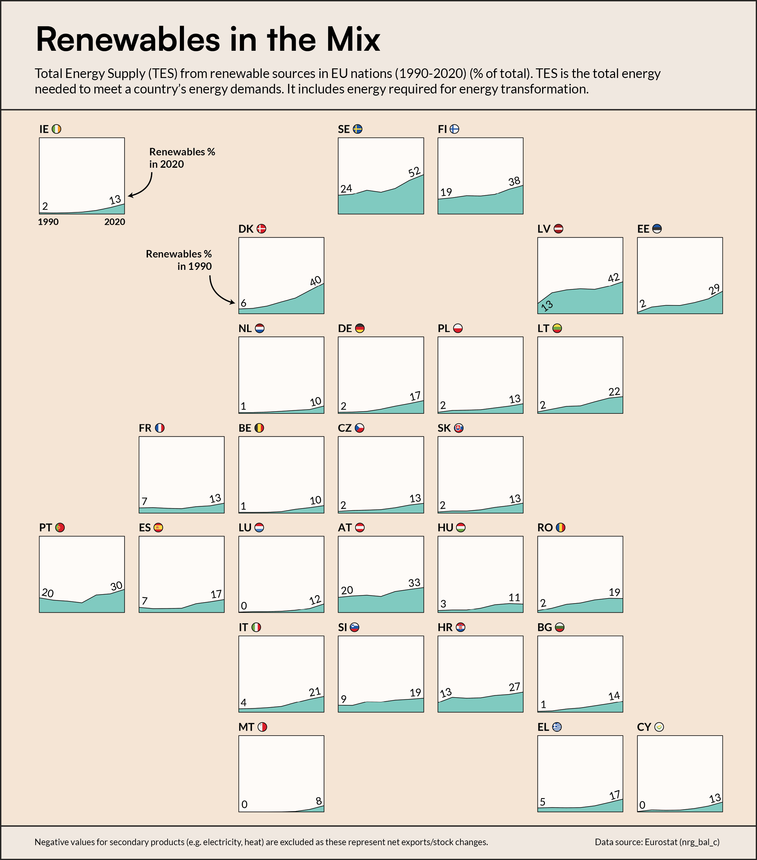 Figure 3: Renewables in the Mix
One final intriguing graph is Figure 4, which shows the breakdown of renewable energy by source in each country.
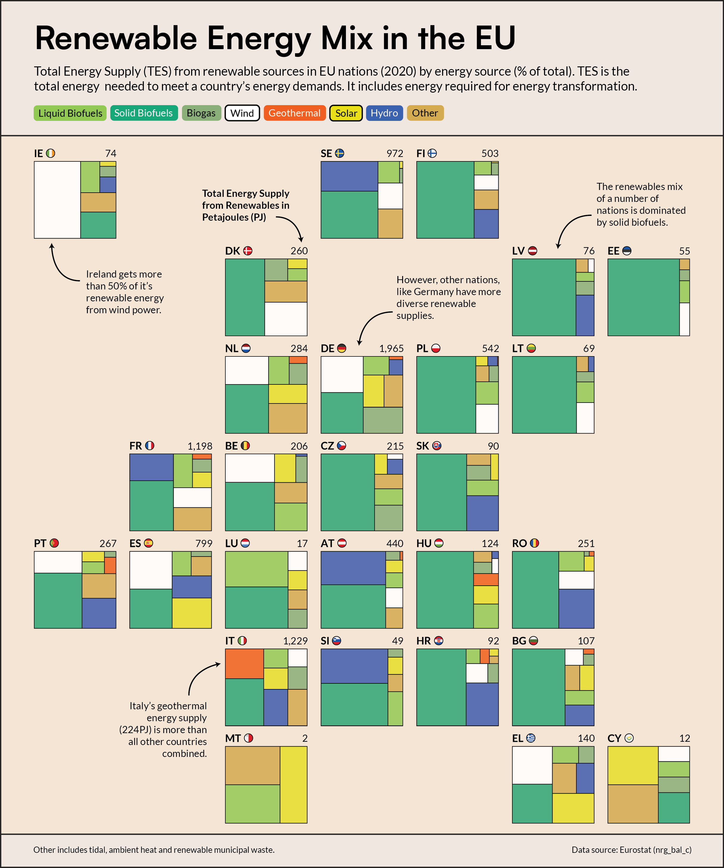 Figure 4: Renewable Energy Mix in the EU
I expected one of either wind, solar or hydropower to be the main renewable energy source, but actually solid biofuels is the dominant source in most nations. However, there is a level of variance here and some countries, like Spain, Italy and Germany have more diverse renewable energy supplies.
On the other hand, It’s not surprising to see a low percentage of solar in Nordic countries, where they only get about 6 hours of sunlight in the winter, compared to more solar-panel-friendly Southern European Nations like Spain, Greece and Cyprus.
Interestingly, Italy has the largest share of geothermal in it’s renewable energy mix. In fact, Italy’s geothermal energy supply is more than all other countries combined. Italy was actually the first country in the world to build a geothermal plant in 1913 and the country has gradually built up their installed capacity over time, taking advantage of rich geothermal resources in Tuscany.
Ireland also has the largest percentage share and majority of it’s renewable energy coming from wind, while Cyprus has the highest share of solar, and similarly Slovenia has the highest for hydroelectric, Luxembourg for liquid biofuels and Germany for biogas.
Final thoughts
It was interesting to make these charts and investigate the differences in EU countries’ energy supplies. However, Eurostat really didn’t make it easy to understand and analyse the data, especially as I don’t have a background in energy data - but because of this I also learned a lot about this area which is always nice.